POLARITY,
COLOR & ORIENTATION ATTRIBUTES IN MOTION AND TEXTURE PERCEPTION
***
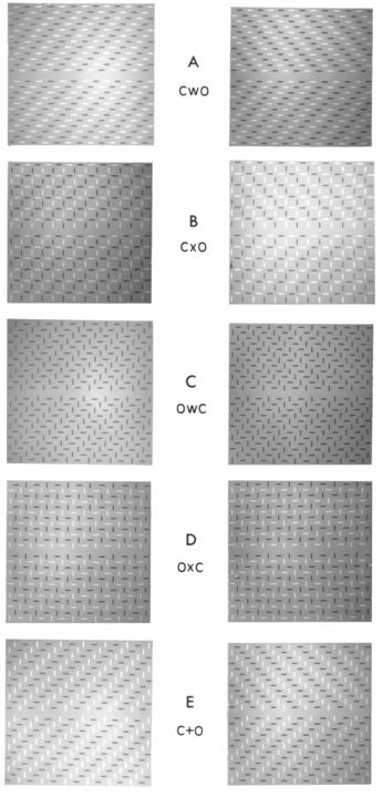
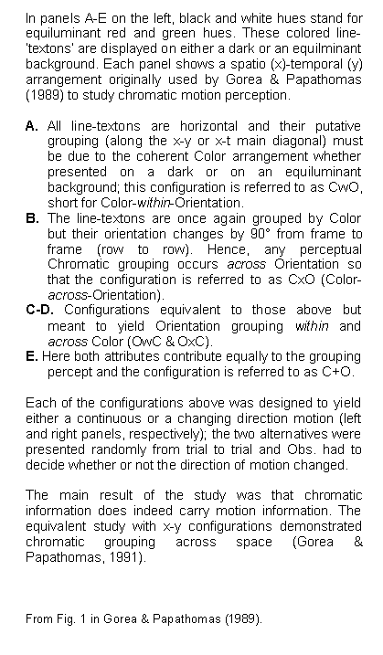
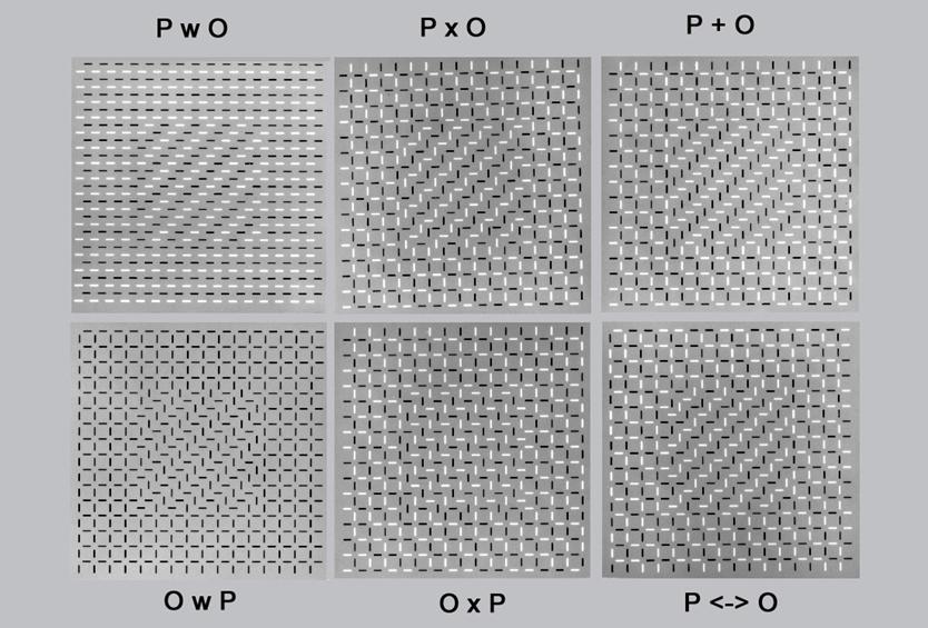
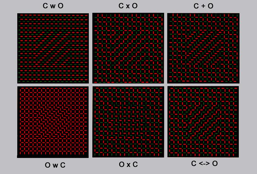
Black
and white (A) and red and green (B) texton configurations demonstrating texture
discrimination based on Polarity (P) or Color (C) and Orientation (O). Notation
is the same as above. The new configurations coined P <-> O (Polarity against
Orientation) and C <-> O (Color against Orientation) yield
competing groupings for P/C and O (along the positive and negative diagonals,
respectively).
A
B
***
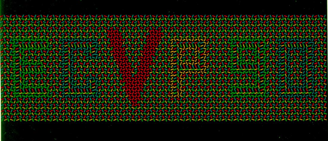
The logo of
the European Conference on Visual Perception organized by
A
B
***
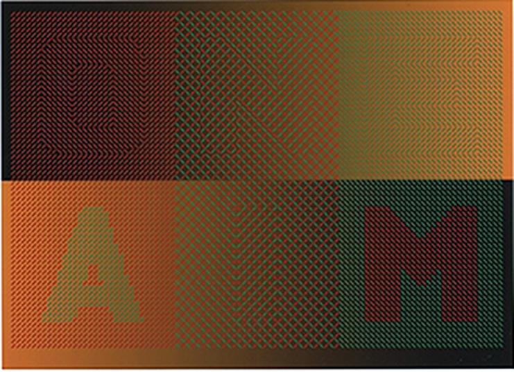
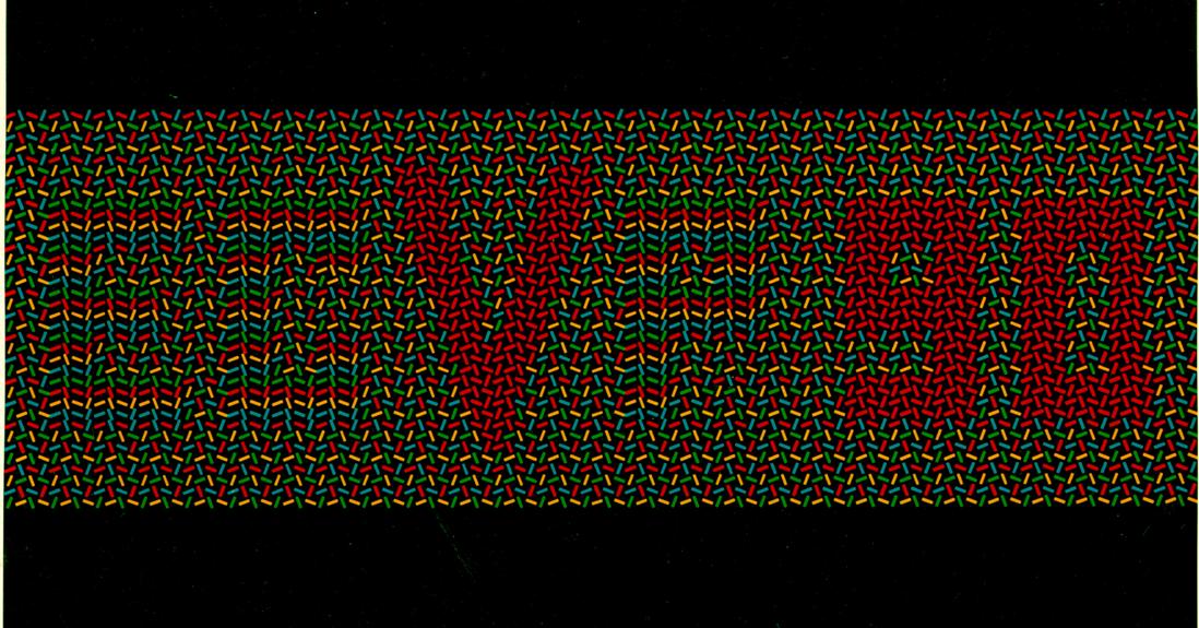
The image
below was exhibited as part of the collective art exhibition Thresholds: Limits of
Perception at the New York Arts Biennial 1997, New York City , N.Y.,
October 14-25 under the title "Now
you see it, now you don't; or don't you?" co-authored by T.V. Papathomas
& A. Gorea. The text is “ONE AIM”.
Using the
same grouping principles as above, letters "O" and "E"
(top) are “carried” by orientation coherence; letters "A" &
"M" (bottom) by color coherence and letters "N" (top) &
"I" (bottom) by both color and orientation coherence.
Now you see it, now you don’t
